
It's no secret that the seventies have come back with a vengeance. One of the
amazing things about fashion revival, in my humble opinion, is its tendency to
resurrect the best of any given era.
I think most of us will admit that with
any generation there are always horrendous trends we’re happy to bid adieu
(goodbye neon and first generation stretchy jeans), but the ones that make
their way back around seem to withstand the test of time; especially when
integrated into fresher trends (hello Birkenstocks and minimalist fashion).
Wall weaving I think falls into the latter category. With
the popularity of the gallery wall in residential homes these days comes the
need for additional aesthetic interest in the form of varied textures. Weavings
satisfy this need magnificently. They look fantastic on a wall mixed with
framed prints; they add warmth by breaking up the glass, metal and wood; they’re
easy to make and customizable to any pallet your room decor may embody.
I won’t bore anybody with a detailed tutorial on how to
actually make a wall weaving. It’s been done; and done fantastically. You don’t need to go any further than these
tutorials from Honestly
WTF and A
Beautiful Mess. As far as steps and visual aids, you need go no further.
However, I did learn some things in my personal weaving experience.
First, before I tell you what I learned, here’s some basic jargon just so you know what the heck I’m talking about.
Warp – This is the base of your weaving, or the vertical
threads.
Weft – This is the ‘rest’ of the weaving, or the fun part
that threads horizontally throughout the textile. This is where all the
creativity comes in. The weft can be any type of yarn in any thickness or
color.
Okay, here’s what I learned:
1)
Don’t be afraid to incorporate beads into your weaving.
I didn’t happen to do this for the weaving
shown in my images, but it’s a nice addition. BUT, it’s much easier to
incorporate the beads in the WARP instead of the weft. This is mainly because, more often than not, the weft
consists of thick, bulky yarns and such.
It’s very hard to thread a bead onto a thick yarn. As your setting up
your warp, however, throw on a few beads of your choice and weave around them as
you go along.
2)
If you have a fuzzy pet you WILL get fur all up
in your weave.
 |
| You can see dark dog hairs embedded in the roving and lower left side... |
Don’t fight it, it’s going to happen no
matter what you do. You could weave in a hermetically sealed room in your home
and still get fur all up in your weave. Just accept it and do your best to
pluck them out with tweezers when you’re all done.
3)
Use textures OTHER than yarn:
 |
| You can see the hemp I braided in the middle. |
To make your weave more interesting,
incorporate avant garde textures like leather, hemp, twigs or scraps of fabric.
I happened to have a giant ball of hemp sitting around, so I wove a few strands
into a braid as long as the total width of my finished weaving and wove that
braid through the warp in lieu of other yarns. Let your creativity shine
though. Think outside the box. In the spring I’d love to weave fresh herb
sprigs into my textiles to add interest and (bonus!) a heavenly aroma.
4)
Don’t use more than (about) five colors.


This rule excludes your ‘avan garde’
textures. Here, I’m just considering the yarns themselves. Here’s how I like to
do it: pick three colors that are all a part of the same family. In my case I
chose four neutral colors in creams, grey and white. The remaining two yarns should be accent
colors not in the family of the previous ones. In my case these were the
mustard yellow and lavender. I thought they complimented each other nicely,
worked with the colors already in my room and didn’t fight with my neutral
yarns. Follow this rule and your weaving will never look like bag of skittles
slapped on your wall.
5)
To finish off your weaving tie knots at the top:
Some tutorials will tell you to cut the
loops at the top, tuck the extra threads back into the weaving and add new
loops to slip a rod through. Personally, I found it much easier to just slip
the warp off the pegs and tie knots flush with the yarn (weft) all across the
top. This method keeps all the yarn in place, while also providing a loop to
slip your rod, pole or branch through. Of course, if your loom doesn’t use pegs
and instead requires that your wrap the warp around the loom in a crisscrossing
fashion, then you’ll be forced to
cut the warps.
6)
If at all possible, don’t cross the warps:

The picture frame DIY method works wonderfully, but it does force your to cross the warps. When this is the case, weaving the weft over and under becomes much more difficult because the warps are not all on the same plane, if you catch my meaning. So, the first several rows are difficult to start. To avoid this problem, I used the peg loom. I found it much easier. They’re not all that expensive and especially worth the investment if you plan on making several wall weavings for a gallery wall or as gifts. Another option is to hammer in some nails into a picture frame to make a peg loom in a pinch. Just make sure the frame is sturdy and protect yourself accordingly when using a hammer.
7)
Mix it up by changing the color of the warp:
 |
| Above the roving is the remaining unused warp. Change the color to mix things up! |
You can add a whole new layer of interest
to your weaving if you change the color of the warp threads. If you’re
clever enough you could even come out with a plaid effect.
8)
Wool roving is great:

Roving is the big chunky loopy stuff at the
top of my weaving. Essentially, roving is the yarn before it’s actually spun
into yarn. It adds great texture and makes your weaving look a cut above the
rest. Roving is a little more expensive per pound compared to most yarns but it goes a LOOOONNGG way. I bought a pound of it and this particular weaving didn't even make a dent in my supply. I could probably make 20 more weavings with what I still have left over.
9)
Leave some of your tassels in loops:

If you’ve perused the tutorials mentioned
above then you’ve learned how to make a tassel. If this is the case then you’ll
know once you’ve made your tassel, some of the threads will be looped. Why not
leave them in place? The tassels on the bottom of my weaving I cut, but the
ones in the middle I mixed up a bit. As you can see I left the yellow ones
partly looped. I just liked the way it looked. Also, it was a small feature
that made the yellow tassels on the bottom look different from the ones on top.
10)
Balance out the focal points:
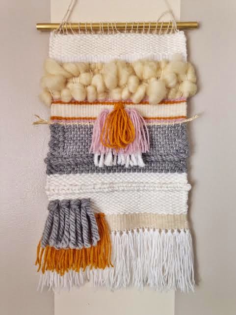

By focal points I mean things like tassels,
extra-large textures (roving), incorporated twigs/herbs, and unusual textures.
These things all add interest, but less is more. I balanced out my focal points
by limiting myself to three: the yellow and grey tassels at the bottom; the
white, lavender and yellow tassels in the center; and the wool roving at the
top. By limiting my focal points to
three and placing them the way I did, I invite the eye to wander across the whole
weaving instead of landing on any particular spot.
11) Weave in different patterns.

You can break up the monotony of using one particular yarn by weaving it in a different pattern.
I hope these tips help you on your own weaving adventure!


